Lately I've seen a number of wedding invitations, and I've mentally and silently screamed, "why why why" a la Nancy Kerrigan. I consider myself an amateur wedding invitation connoisseur bc it marries (pun intended!) my interest in graphic design/typography with pretty weddings. I'm pretty sure I spend more time looking at stationery then the average human. Here are just three short WHYs I want to share today.
WHY is there so much stuff, you tree killers?
Tissue paper, RSVP card, RSVP envelope, inner envelope, outer envelope, reception cards, card with map, paper band...so many enclosures! Is there really a need for all that stuff? Whether you have a formal black tie wedding or a casual outdoor picnic wedding, being as green as you can is always appropriate. (But not 100% green... I still love snail mail and paper invites!) Let's be honest, even if you don't give a hoot about the environment, ask yourself WHY you need each piece of the invitation before you stick it in. Does it mean anything to you? Do you need to have it in there to convey something dire? Is it impossible to include it in the text of the invitation itself? As tempting as it is to have tons of beautifully designed pieces of paper floating around, in the end fewer pieces = cheaper for you & less tiny pieces of paper for your friends and family to lose. Also, chances are you're trying to save money. It's better to spend $1 for 1 basic invite that looks nice than $1.21 on a 5-piece invitation suite that looks el cheap-o DIY-o. I love DIY, but DIY that doesn't
look DIY. It's confusing, I know. No one will remember how many enclosures you had, but they might remember how el cheap-o your invitation looked.
WHY are you using that font?
 |
| [All my unfavorites all in a row] |
If it's the default font on your Microsoft Word, don't you dare use it on your wedding invitation. I especially hate the fonts Curlz, Comic Sans, and Papyrus. To be fair, I have never seen those used on a wedding invite, BUT I have seen Arial, Times New Roman, and Lucida. Kill.Me.Now!!! Let me tell you when these fonts are appropriate. Comic Sans is appropriate when you're in 6th grade and your'e sending a Valentine's Gram to your best friend. Jokerman is appropriate when you're the editor of your Junior High Newspaper and you use it to headline the Knock Knock Joke section. Papyrus is appropriate when you're making a scavenger hunt for little kids about Egypt. Verdana is appropriate when you want to bore your readers to death. And Curlz is appropriate NEVER. WHY would you do this to your wedding guests and yourself?! When there are so many FREE fonts?!
WHY are you having a wedding?
Well, you're having a wedding to start and celebrate your marriage. So, make sure your invitation emphasizes YOU and the WEDDING and maybe even LOVE. Don't emphasize weird things like the RSVP due date, the time of the wedding, or the afterparty. You can definitely (and should) include those items, but don't use outstanding font - size or color, etc. If you're having a destination wedding or the location is of special significance, that can be nice to highlight.
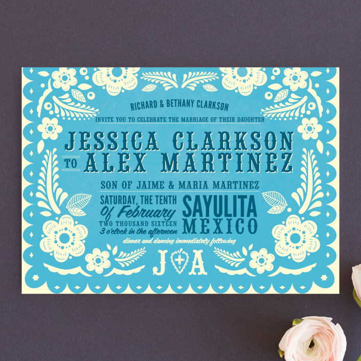 |
| [Si, this invite es bueno. From minted] |
I will end this post with a plea to the world wide internet. There are SO many pretty but inexpensive options now on the internet. Please don't send out ugly invitations. I dream about the day when my friends need invitation advice/help. I have seen so many invitations in my crazy blog wanderings that I have a mental rolodex of invitation styles, variations, and tips. Somebody ask me for ideas. Please?


HIIIILARIOUS!!! I had to stifle my laughter at work. I want/need your advice! :)
ReplyDelete